When your brand outgrows its own collateral
March was a particularly busy month in our studio, with multiple capability statement projects running simultaneously. Two have recently gone to market for our clients Orecast and BWE Drilling — and we’re genuinely proud of how both came together at the intersection of strategic marketing intent and sharp design aesthetics.
But these projects reinforced something we see time and again: most organisations drastically undervalue their capability statement. It’s often treated as an operational document — something procurement needs, something that sits in a tender response, something that gets thrown together when a deadline looms.
That’s a missed opportunity. Because a well-designed capability statement is one of the hardest-working marketing assets in your entire toolkit.
More than a list of services
A strong capability statement does far more than catalogue what you do. It tells the market who you are, why you’re different, and — critically — it showcases the evidence that supports a compelling value proposition for customers. It’s often the first substantial piece of branded collateral a potential client reads. And in industries like mining, resources, construction, and professional services, it’s frequently the document that gets you through the door — or doesn’t.
Think about the context in which capability statements are consumed. A procurement manager is reviewing six, eight, maybe twelve from competing businesses. They’re scanning quickly. Within seconds, they form an impression — not just of what you do, but of how seriously you take your own brand. A generic Word document with clip art and a stock photo sends one message. A strategically designed, visually distinctive capability statement sends an entirely different one.
What separates good from great
The best capability statements we produce share a few common characteristics.
They lead with positioning, not services. Before listing a single capability, they establish why the organisation exists, who it serves, and what makes its approach distinctive. This is brand strategy applied to a document — not graphic design applied to a template.
They tell stories with evidence. Case studies, project highlights, data points, client outcomes. Not “we have extensive experience” but “we delivered a 340-metre shaft in 18 weeks, 12% under budget.” Specificity builds credibility. Vagueness destroys it.
They are designed as brand expressions. Typography, colour, layout, imagery — every element reinforces the brand identity. The capability statement should feel like it belongs to the same family as your website, your signage, and your fleet. Consistency builds recognition. Recognition builds trust.
They are structured for how people actually read. Scannable. Modular. Clear hierarchy. Nobody reads a capability statement cover to cover. They flip to the section that’s relevant to their needs. The structure should accommodate that behaviour.
A look at what we’ve been building
Our recent work for Orecast and BWE Drilling illustrates how these principles come together in practice.
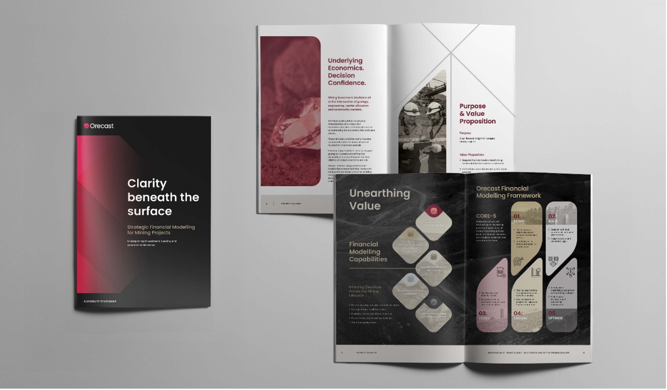
For Orecast — a specialist in mining financial modelling and forecasting — the capability statement needed to project the same precision and sophistication as the analytical models they build. The garnet and earth-tone palette we developed for their brand identity carries through into every page, with stratified visual layers that reference the geological data at the heart of their work. The result is a document that feels as rigorous and considered as the services it describes.
For BWE Drilling — operating in the demanding world of mineral exploration drilling — the challenge was different. The capability statement needed to convey scale, reliability, and operational capability while differentiating from competitors in a sector where everyone claims to be experienced and safety-focused. We built the document around concrete project evidence and a visual system that communicates engineering confidence without resorting to the clichés of the industry.
Both projects started with strategy, not design. Before a single layout was drafted, we worked through positioning, value proposition, audience analysis, and competitive differentiation. The design then served the strategy — not the other way around.
When it’s time to level up
Your business has evolved but your collateral hasn’t. You’ve added new services, entered new markets, or won projects that your current capability statement doesn’t reflect. The document is describing a version of your business that no longer exists.
You’re competing for bigger work. As you move into larger tenders, joint ventures, or new client segments, the quality of your collateral is measured against a higher benchmark. What worked when you were a $5 million business may not cut it at $50 million.
Your brand has been refreshed but your documents haven’t caught up. A new logo and website are visible — but if your capability statement, proposal templates, and sales collateral still use the old brand, you’re undermining the investment you’ve already made.
You can’t remember the last time it was updated. If the answer is “a couple of years ago” or “I’m not sure,” it’s time. Markets move. Your capability statement should move with them.
The bottom line
Your capability statement is often the first — and sometimes the only — chance you get to make a substantive impression on a prospective client. It should work as hard as every other part of your brand.
If your current capability suite isn’t doing justice to where your business is today, we should have a conversation. We bring the same strategic rigour to a capability statement as we do to a full rebrand — because the principles are the same. Clear positioning. Compelling evidence. Beautiful execution.
Time to level up? Let’s grab a coffee.


